These are some examples of typography experiments from my Creative Practice project. I really enjoy typography, so I thought these deserved a look-in.

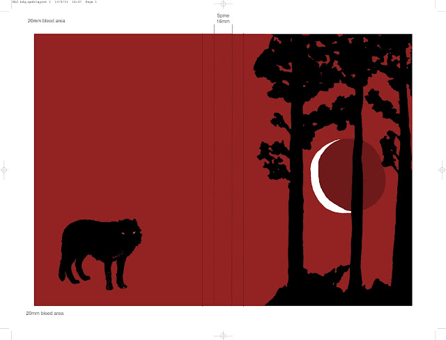
These images were for my first project of last year. I entered the Folio Society's book illustration competition, for which I had to create 3 illustrations for Angela Carter's 'The Bloody Chamber', a collection of sumptuous gothic tales, based on various old fairytales. The project was not my most successful, but these are some of the better outcomes. The first is the cover design, and the second is the finished illustration for the title story, 'The Bloody Chamber'.
These two were components in the other two illustrations; the first, 'The Company of Wolves', and the second, 'Puss in Boots'. I was pleased with the drawings themselves, but the finished illustrations were not up to scratch.
Based on the wolf, I made a series of screen prints with original ink backgrounds, to sell in the 'Bespoke' exhibition and 'Hibernal' market stall. These card designs are the only digital images I have of them, but they give the general idea.
And, finally, this is a draft for a paid commission, which I completed during the summer.


No comments:
Post a Comment